
Drip Check · 26 October 2026
Drip Check 16: Kate McFarlane, a repeat that has to line up every time
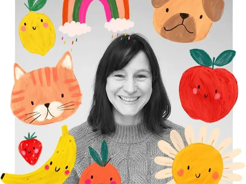
Before Kate McFarlane paints a single smiling banana or a happy little fox, she has already worked out where the edge of that shape needs to sit, because the whole point of her job is that it has to line up again on the other side.
The work
McFarlane is a British illustrator and surface pattern designer based in Nottingham, England. She graduated in 1999 with a first-class degree in textile design from Manchester School of Art, then spent two years at a print design studio in New York City, hand-painting graphics and patterns for womenswear and kidswear. Back in the UK she worked in-house as a print designer for a major childrenswear retailer before going freelance in 2012. She is now represented by Emily Jones at The Bright Agency.
Her designs have turned up on children’s clothing, shoes, accessories, pet products, craft fabric, greetings cards, gift wrap, books, toys and games, for clients including Glick, Djeco, Priddy Books, Dashwood Studio, The Foggy Dog, Little Sleepies, George at Asda and Tu at Sainsbury’s. She works digitally, building bold, bright colour with visibly hand-painted, textured brushwork rather than flat vector shapes, and has said she has been drawn to pattern since childhood, enjoying what her agency describes as the mathematical precision of a technical repeat. “I hope the love I put into my art shines through,” she has said of the work. Of seeing a design go into production, she has said: “Seeing my pattern designs come to life on fabric has been a dream come true.”
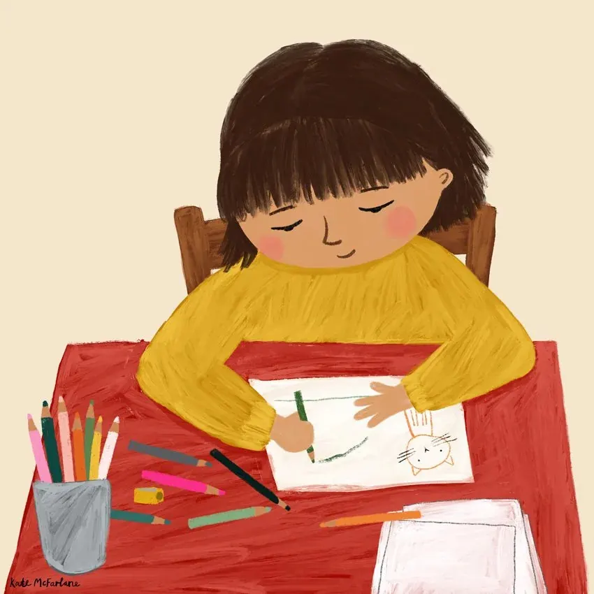 © Kate McFarlane. Source: katemcfarlane.com
What we see as makers
A repeat is a design decision, not a technical afterthought. McFarlane plans how a shape tiles before she finishes painting it, so the pattern can run edge to edge without a visible seam. A tufter laying out a bordered panel or an allover motif can do the same: decide how the repeat unit meets itself at the edge before the gun ever touches wool, instead of discovering a mismatch at the last row.
One character has to survive every surface it lands on. The same smiling banana or fox she draws for a greeting card also has to work on fabric, a book page or a pet bandana, without being redrawn for each one. A tufter sketching a motif for a small test piece can design it to scale up cleanly to a cushion or rug later, rather than starting the design over at a bigger size.
Visible brushwork softens a bold colour. McFarlane paints her flat, saturated shapes with textured, hand-painted strokes instead of a smooth vector fill, which keeps bright colour from feeling cold or mechanical. A tufter can borrow that instinct by leaving a little pile variation at the edge of a bold colour block instead of trimming it dead flat, so the shape still reads warm up close.
The drip connection
McFarlane’s colour is controlled down to the repeat: every shape is placed with a seam in mind, checked until it tiles without a gap. Jan Fechner’s drip tufting, developed at BUBU Studio, works from the opposite instinct, letting colour run and bleed as the gun moves, with no seam to protect and no repeat to match. McFarlane has to know exactly where a pattern will meet itself again. Jan only has to know where he wants a colour to start before he lets it go.
Want to try colour that does not have to repeat on cue? Book a session in Paphos.
Sources: Artist profile, The Bright Agency, thebrightagency.com/uk/licensing/artists/kate-mcfarlane. Artist biography and About page, katemcfarlane.com/about. Artist website and gallery, katemcfarlane.com.
Try it with yarn in your hands.
Tufting workshops in Paphos, every week.