
Drip Check · 30 October 2026
Drip Check 20: Max Machen, the limit that built the style
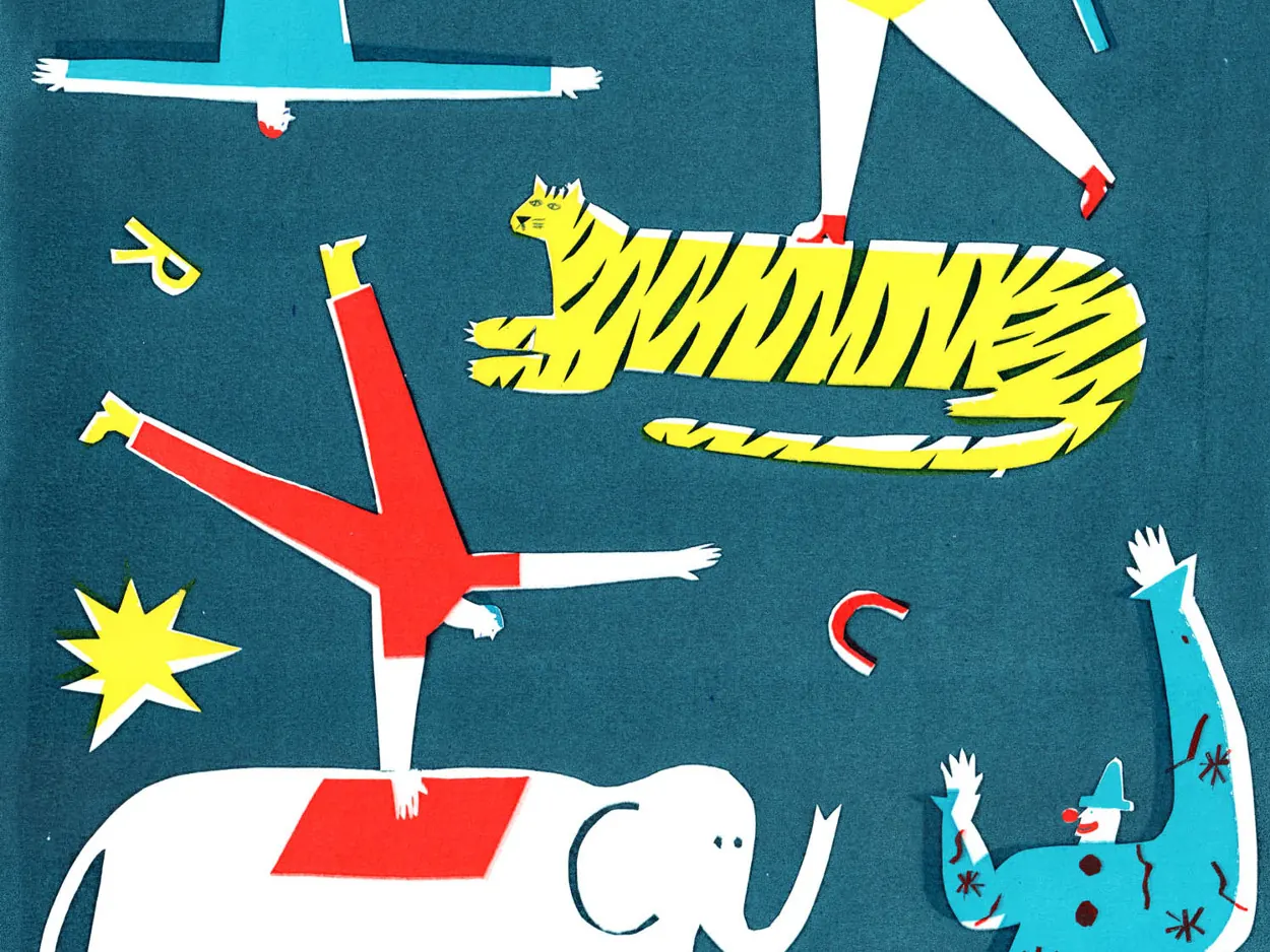
Max Machen builds a tiger, a clown and a whole circus out of what looks like five colours, and none of them ever had to touch an edge it did not plan for first.
The work
Machen is an illustrator and printmaker originally from Yorkshire, England, now working from a studio in Scotland. He studied illustration at Cambridge School of Art, where he did his first silkscreen workshop at Print Club London and found the process that has shaped his work ever since. Screen printing forces a design into a small stack of flat colour layers, each one printed separately and lined up by hand, and Machen has said that limit is what built his visual voice. “The restrictions that came with the way I screen printed evolved into my bold, visually witty style,” he has said.
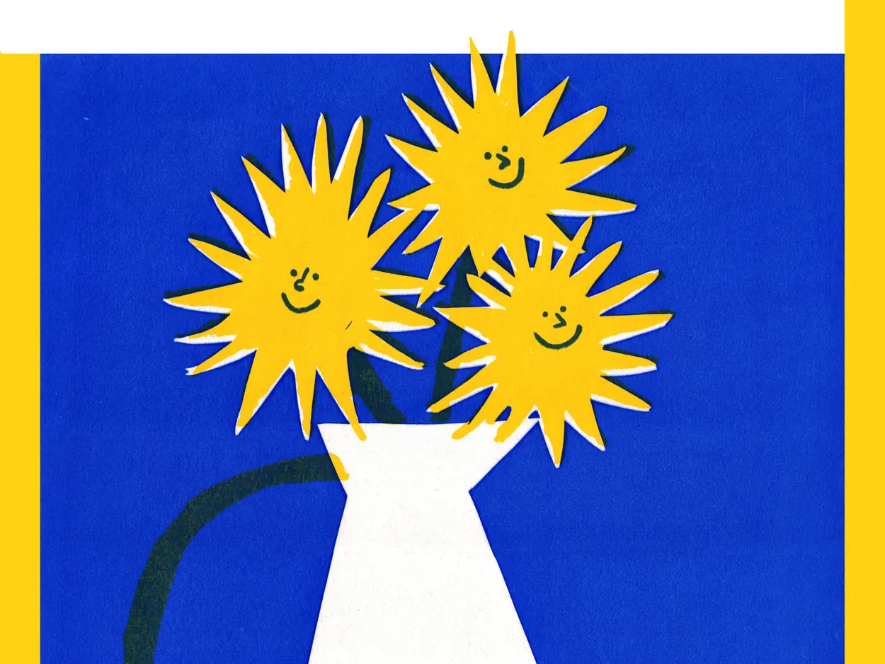
His prints are full of happiness, colour and orderly chaos: circus performers mid-trick, striped tigers, grinning clowns, a vase of smiling sunflowers. He names the French poster illustrators Raymond Savignac and Hervé Morvan as reference points, both known for turning advertising into playful, large-shape graphic design. His commercial work carries the same voice into a magazine cover for The Skinny, posters for the Glad Cafe and the Glasgow Coffee Festival, and packaging for Oatly. Edinburgh Printmakers has sold limited runs of his screen prints, including Flight of Whiskey and Square Go.
 © Max Machen. Source: maxmachen.com
What we see as makers
A small set of flat colours can carry a busy scene. Machen’s circus print holds a swinging acrobat, a tiger, an elephant and a clown together with what reads as five colours total: teal, red, yellow, white and a little black line work. A tufter choosing yarn for a crowded panel can trust the same economy, since a tight palette holds a busy composition together better than a wide one would.
A face needs almost nothing to read as happy. His sunflowers get two dots and a curved line each, nothing more, and the whole bunch reads as cheerful before a viewer even registers that it is flowers. A tufter adding a face or character to a panel can stop at the same two or three marks instead of tufting detail the shape does not need.
A constraint kept on purpose becomes a style. Machen could work in unlimited colour digitally, but he keeps working inside the layered discipline of screen printing anyway, because that limit shaped his voice in the first place. A tufter can set a rule the same way: cap a panel at four yarns and let the restriction do some of the designing.
The drip connection
Screen printing is built from separate, precisely registered layers: one colour goes down, dries, and the next is lined up exactly on top of it, with no colour ever touching the one before it mid-print. Jan Fechner’s drip tufting, developed at BUBU Studio, throws that discipline out. He lets the wool of one colour run straight into the next while the gun is still moving, so the blend happens live instead of in careful, separate layers. Machen builds a tiger stripe by registered stripe. Jan lets one stripe bleed into the next on purpose.
Want to see what colour does once the registration marks come off? Book a session in Paphos.
Sources: “Meet Max Machen”, Baltic Shop journal, Northern Makers series, shop.balticmill.com. Artist profile, Print Club London, printclublondon.com/artist/max-machen. Artist website, maxmachen.com/About-me.
Try it with yarn in your hands.
Tufting workshops in Paphos, every week.