
Drip Check · 5 November 2026
Drip Check 26: Anne Laval, colour that keeps its edges
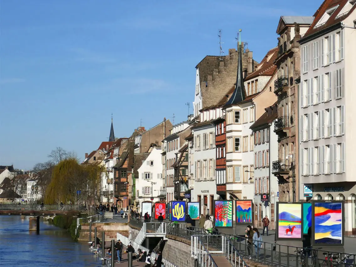
Walk along the Ill river in Strasbourg and you can run into an Anne Laval exhibition without meaning to: twenty of her paintings, blown up onto advertising light boxes, standing between the bridges and the bicycles like any other street poster.
The work
Laval works from a studio in Strasbourg, where she trained at the École supérieure des Arts Décoratifs. Her practice splits two ways: picture books for publishers such as Les Fourmis Rouges and Le Rouergue, and large-format posters for theatres and cultural seasons, including Scènes Croisées de Lozère, the CCAM in Vandœuvre and Le Volcan in Le Havre. She has also illustrated for The New Yorker. Her books include Ce qui nous lie, La fille de l’autocar, Une belle journée, Le Nombril du monde and Spoon.
That riverside show, La belle échappée, printed twenty A3+ paintings as giant posters along the Strasbourg quays for the Central Vapeur festival in 2018, then travelled to the Colomiers comics festival, with a run of six risograph prints made from the same images.
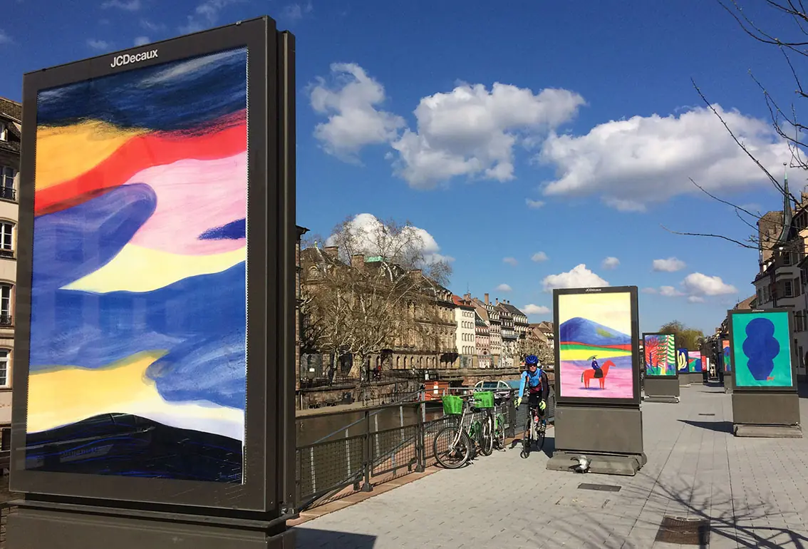 © Anne Laval. Source: annedessine.free.fr
Her process starts small: coloured pencil sketches in a notebook, built up later into gouache and pastel, often finished with hand-carved stamps, then screen-printed in large format by print houses such as Lézard Graphique for the posters. She keeps coming back to two colours, ultramarine blue and vermilion red, and names Matisse, Alexander Girard and Fredun Shapur as reference points. “Sometimes I’m touched just by the combination of two colours,” she has said. This June she took the practice to Seoul, invited by the French embassy to design the poster and pavilion for a book fair marking 140 years of France-Korea relations.
What we see as makers
A two-colour favourite is still a working tool, not a mood board. Laval returns to ultramarine blue and vermilion red across books, posters and prints that otherwise look nothing alike. A tufter can build the same kind of signature: one fixed pairing, reused deliberately until it reads as a hand.
Keeping colour inside its own edge is a choice, not a limit of the material. Gouache and watercolour blend easily, but her colour areas stay separate and self-contained, a habit tied to years of preparing flat colour separations for print. A tufter has the same option at the gun: a hard line between two yarns is a decision, not a default.
A pocket sketch can survive being blown up to the size of a wall. Her posters start as small notebook drawings before they are screen-printed metres wide for a festival. A tufter scaling a doodle onto backing cloth can trust the same energy carries, if the shape stays simple enough.
The drip connection
Laval’s colour fields hold their ground. A red stays red up to its border, then a blue begins, even though her materials would happily blend if she let them. Jan Fechner’s drip tufting, developed at BUBU Studio, makes the opposite call with the same kind of materials: he lets wool run past its edge on purpose, so one colour bleeds into the next as the gun keeps moving. Laval proves restraint is a style. Jan proves the opposite is too.
Curious what happens when colour is allowed to run? Book a session in Paphos.
Sources: Artist website and news journal, annedessine.free.fr. Artist biography, The Poster Club, theposterclub.com/pages/artists/anne-laval. “Anne Laval”, Cartoon Brew, Artist of the Day, cartoonbrew.com/artist-of-the-day/anne-laval-93427.html.
Try it with yarn in your hands.
Tufting workshops in Paphos, every week.