
Drip Check · 20 November 2026
Drip Check 41: Émile Orange, colour that will not sit still on film
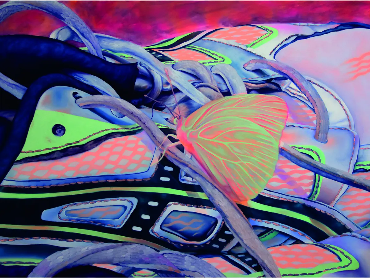
Émile Orange paints in colours so hot they will not photograph the same twice.
The work
Orange was born in 1993 in Cherbourg, at the tip of Normandy, and trained at the Superior School of Art and Media (ESAM) in Caen, where he finished a master’s degree (DNSEP) in 2017 after a study exchange in Quebec. Residencies in Paris and then Prague followed straight after graduation, and he has since shown work between Paris, Mulhouse and his home region. Since 2019 he has also worked as a plastic mediator specializing in contemporary art at the FRAC Normandy, the region’s contemporary art fund, and he runs an associative project called Super4 out of Caen, mixing events and graphic design with his studio practice.
His paintings are figurative and diaristic: a sneaker tangled in its own laces with a moth resting on the toe, a man crouched in waist-high grass, a close-up ear with an earring, a self-portrait lit entirely in red. He labels each canvas with the place and year it was painted, the way a travel journal would, from Guadeloupe to Paris to a hamlet in the Manche. The paint itself is pushed through fluorescent pigments, which means the colour shifts and glows in a way standard reproduction cannot hold onto. He has named Edward Hopper, Jacques Monory and Nina Childress as reference points, and his stated interest is in light that mixes an electric source with a sun that has dropped too low, a collision he returns to across very different scenes.
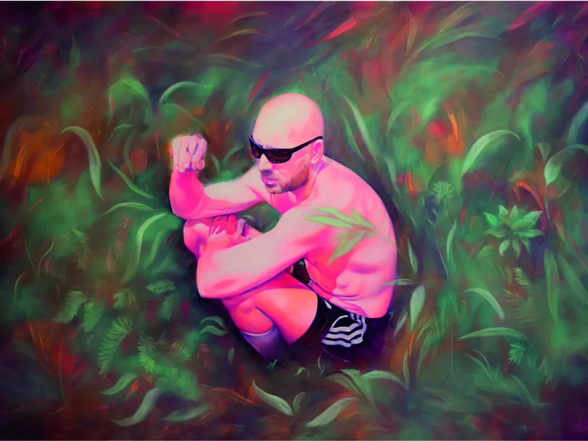 © Émile Orange. Source: emileorange.com
What we see as makers
A material can be the idea, not just the means. Orange chose fluorescent pigment specifically because it refuses to be copied faithfully by a camera or a printer; the only honest way to see the work is in front of it. A tufter can borrow that same confidence in a material’s own limits, picking a wool or a finish precisely because it behaves differently under different light, rather than fighting that instability.
Labelling a piece by place and year turns a body of work into a map. Every painting on his site carries a location tag, Guadeloupe, Paris, Urville-Nacqueville, so the full catalogue reads like a travel log rather than a loose pile of images. A tufter building up a series of hoops can do the same: date and place each one, and the collection starts to tell its own story over time.
A day job inside the art world can feed the studio rather than compete with it. Orange has worked as a mediator at a regional art fund since 2019, translating contemporary art for the public, alongside his own painting practice. A tufter holding down other work in or around craft and design is not stalling their practice; that proximity is its own kind of research.
The drip connection
Orange’s fluorescent pigment refuses to sit still under a camera, but on the canvas every edge is still drawn, controlled, exact. Jan Fechner’s drip tufting, developed at BUBU Studio, pushes that instability one step further: he lets one colour of wool bleed straight into the next as the gun moves, so the edge keeps shifting even once the piece is finished and on the wall. Orange’s colour resists being pinned down by a lens. Jan’s resists being pinned down at all.
Curious what a colour that will not hold still looks like once it is tufted instead of painted? Book a session in Paphos.
Sources: Artist website, Information and Peinture pages, emileorange.com. Artist biography, Janet Rady Fine Art, janetradyfineart.com. Artist profile, Artsper, artsper.com.
Try it with yarn in your hands.
Tufting workshops in Paphos, every week.